
Brand · Editorial Design
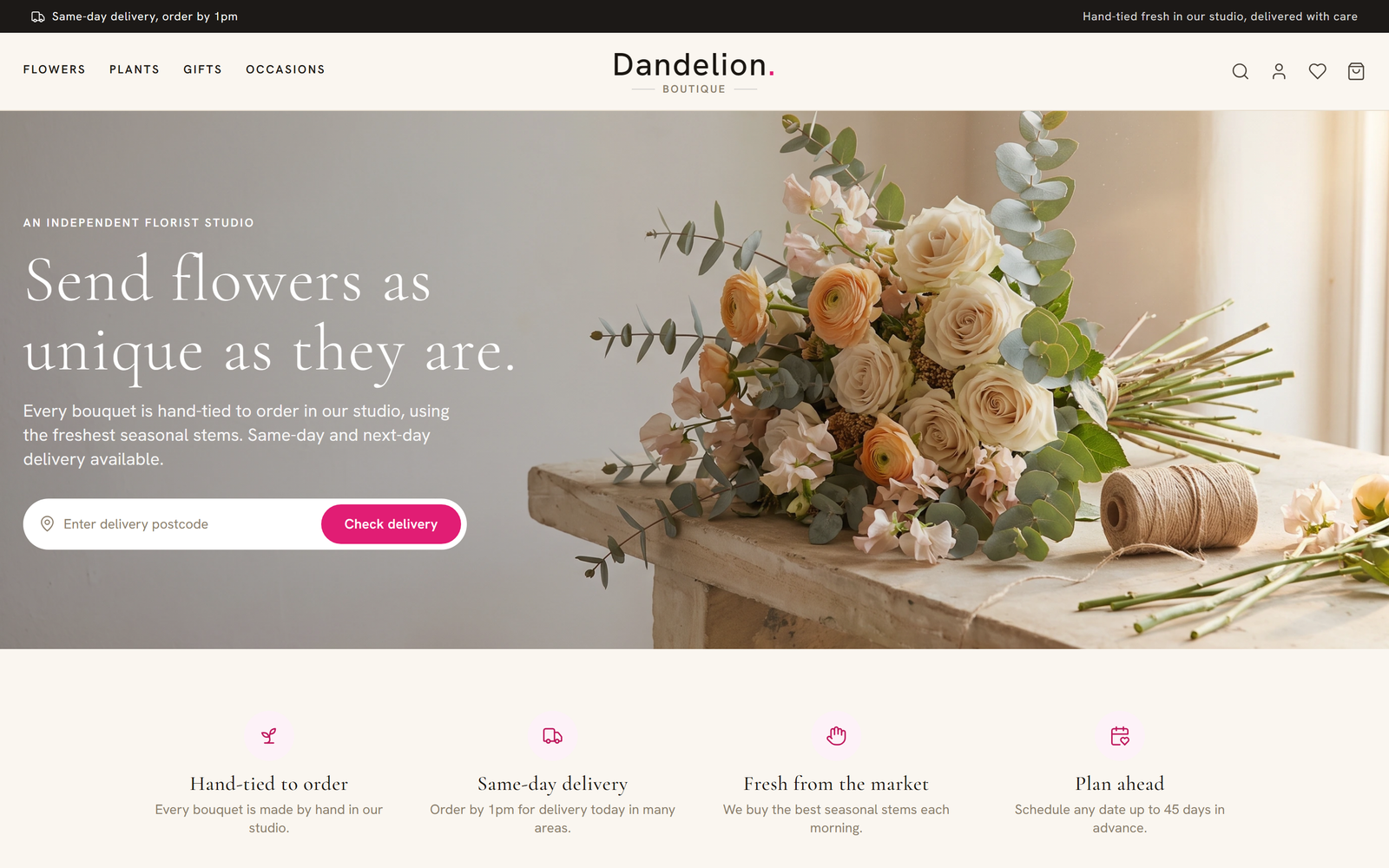
Dandelion Boutique
A florist studio that finally looks the part.
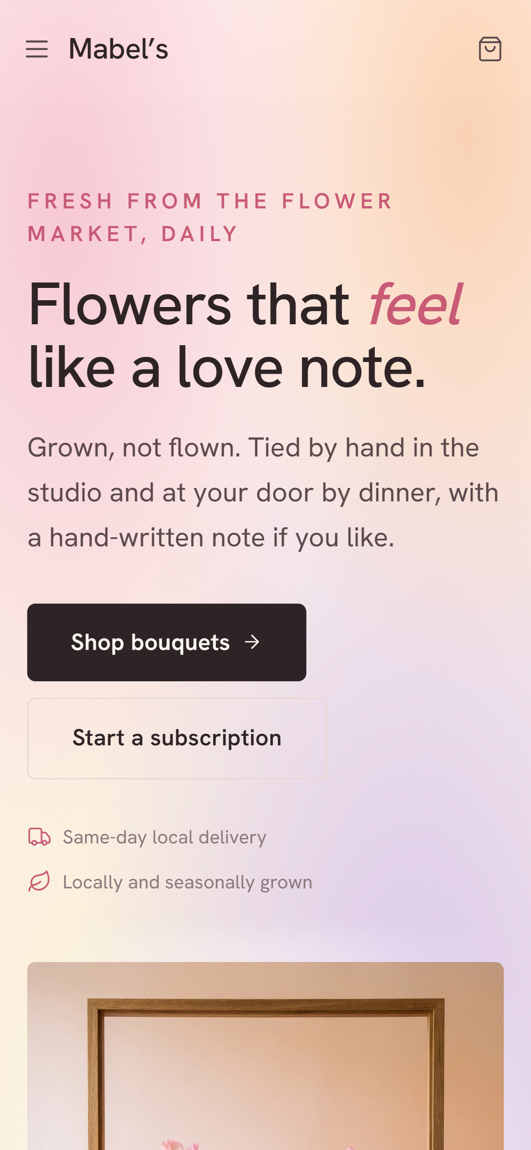
View project →A neighbourhood florist that finally feels like her shop.
Visit the live site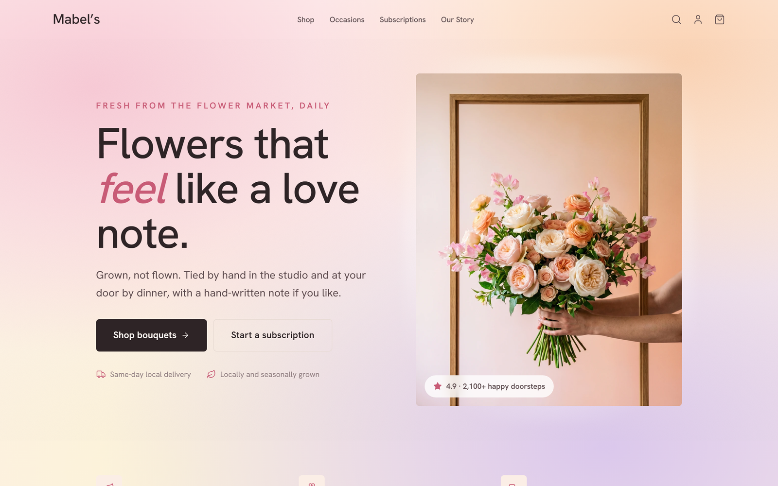
1The brief
Mabel's shop is full of character, all hand-tied bouquets and hand-written notes, but her old website was a stiff off-the-shelf template that looked like every other florist online. She wanted the site to feel like walking through her actual door, warm, romantic and a little tender, not a generic form with a basket bolted on.
2What we built
We built the whole brand and site around that feeling. One soft pink-to-peach gradient fills every page, the elegant Cormorant serif carries the tagline 'Flowers that feel like a love note', and her real voice leads with 'Grown, not flown. Tied by hand in the studio and at your door by dinner, with a hand-written note.' Same-day local delivery sits right up front, a Subscriptions tab lets regulars set up standing orders, and an Our Story page gives the shop its proper backstory.
3The result
Now the website reads like Mabel's, not a template. Customers arrive already in the mood the shop is going for, the Subscriptions tab has turned occasional buyers into regulars on a standing order, and the hand-written notes plus that same-day promise mean more of her flowers land as little surprises on someone's doorstep by dinner.
“It finally feels like walking into my shop. People message me saying the site made them a bit emotional, which is exactly what I was after.”
Tell us about your flower shop and we'll map out exactly what yours could do. No jargon, no pressure.